Our Logo

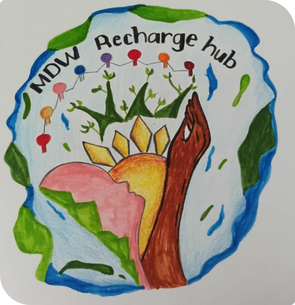
Welcome to our website, where we are delighted to unveil our new logo! Our new design represents our identity, values, and mission. We sought to create a logo that would not only capture the essence of who we are but also resonate with our community. We held a logo design competition in the summer of 2022, inviting migrant domestic workers to submit their original works. Out of loads of submissions, our panel of judges, which included members of the CUHK team and representatives of MDW peer support groups (Domestic Workers Corner HONG KONG; Social Justice for Migrant Workers; Migrant Writers of Hong Kong and Self Love Cupid), selected the winning entry based on creativity, aesthetic presentation and meaning of the design. After careful consideration, Maria Cristina T. Laureta ’s design entry received the most votes and was crowned the winner.
The Meaning Behind The Logo

The symbolism in the Dreamcatcher CUHK MDW Recharge Hub Logo Competition winner goes beyond its aesthetic appeal. It speaks to the importance of mental health and well-being for migrant domestic workers.

The person at the centre, upholding a sun, represents hope, growth, and uprising, which are all vital components of positive mental health. The sun is often associated with warmth and happiness, and its presence in the logo serves as a reminder that there is always hope for a brighter tomorrow.

The background of nature, with its mix of trees, sea, and mountains, exemplifies a sense of tranquil peace and relaxation, which can be essential for maintaining good mental health. Spending time in nature has been shown to reduce stress and anxiety, and the logo’s natural elements serve as a visual representation of this benefit.

Finally, the colourful human figures holding hands demonstrate the unity of the MDW community while embracing its diversity. This sense of community is vital for mental health, as social support can help people cope with stress and overcome challenges.

In short, the Dreamcatcher CUHK MDW Recharge Hub Logo Competition winner’s design is a powerful symbol of hope, growth, community, and well-being, all of which are essential for maintaining good mental health.


This winning entry was then further digitalized and fine-tuned to become the official logo of our initiative. One of the key changes we made was the addition of purple as our brand color. Purple is a powerful color that is often associated with nobility, creativity, and wisdom. In many cultures, purple is also seen as a symbol of courage and strength in the face of adversity. For us, purple represents the resilience and determination of migrant domestic workers, who often face numerous challenges and obstacles in their daily lives. By choosing purple as our brand color, we aim to honour the hard work and contributions of this community while also symbolising our commitment to supporting and uplifting them in every way we can. We are proud to stand with migrant domestic workers, and we hope more will be inspired to join us in promoting the mental well-being of migrant domestic workers.
Share: